Color Psychology in Home Office Design

Chosen theme: Color Psychology in Home Office Design. Explore how specific hues shape focus, mood, and momentum in your workspace, with practical tips, relatable stories, and research informed insights you can apply today. Subscribe for weekly color boosts and share your palette experiments.

The Science Behind Color and Productivity

Cool hues like soft blues can calm overactive minds, improving sustained attention and working memory, while strategic reds can sharpen detail detection during proofreading. Finding the right balance between stimulation and calm is key to daily flow and fewer mental crashes.

The Science Behind Color and Productivity

Greens and nature inspired tones help lower perceived stress and mental fatigue, especially after back to back calls. Think of color as emotional ergonomics, cushioning your nervous system so you rebound faster and stay effective through long, unpredictable workdays.

Choosing a Primary Palette for Deep Work

Soft gray, greige, and warm off white simplify your field of view and reduce cognitive clutter. This backdrop helps documents and screens stand out without overwhelming your senses, creating a gentle mental runway for deep work and creative problem solving.

Choosing a Primary Palette for Deep Work

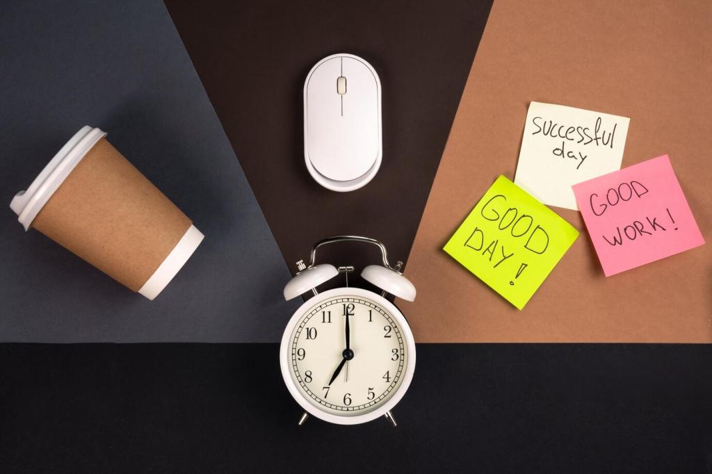
Use mustard, terracotta, or teal as small anchors on a shelf, desk mat, or task wall. These accents inject motivation at a glance without pulling attention away from primary tasks, keeping your overall environment steady yet subtly dynamic throughout the day.

Light, Color, and How Your Eyes Interpret Space

Northern light cools colors, making blues crisper and grays icier. Southern light warms everything, sometimes turning beige yellowish. Test large swatches on multiple walls and observe morning to evening shifts before committing your entire work zone to any single hue.

Light, Color, and How Your Eyes Interpret Space

Cooler bulbs around 5000 Kelvin feel alert and clinical, helpful for analytical tasks. Warmer bulbs around 3000 Kelvin support relaxation and reflection. Hybrid setups with a task lamp and warm ambient lighting let you pivot between precision and calm without repainting.

Color Zoning: Map Your Space to Your Tasks

Use muted blues, dusky greens, or slate tones behind your monitor to minimize distraction and soften peripheral glare. A low contrast backdrop supports sustained concentration, helping you slip into flow faster and return to it after inevitable interruptions.

Color Zoning: Map Your Space to Your Tasks

For video calls, choose mid tone colors like soft olive, denim blue, or warm taupe. They flatter skin tones and communicate calm competence. Avoid intense reds behind you, which can feel aggressive on camera and distract from your message and facial cues.
Introverts often prefer subdued palettes that reduce sensory load, while extroverts may thrive with saturated accents that spark momentum. Test your tolerance by adding or removing colorful elements weekly, then track your energy and mood shifts honestly.
Red signals celebration and power in some contexts, urgency in others. Whites can suggest clarity or formality depending on tradition. Acknowledge meanings that matter to you and your collaborators so your home office communicates respect as well as personal style.
A reader replaced a harsh blue with sea foam after realizing it echoed a favorite shoreline from childhood. Productivity jumped because the space felt safe and inspiring. List colors that evoke supportive memories and build your palette around those anchors.

Budget Friendly Color Psychology Upgrades

Removable Layers With Real Impact

Try peel and stick panels, fabric pinboards, or framed art in targeted hues. Add a plant to introduce restorative greens. These flexible layers let you experiment with color psychology, then refine choices as your workload and seasons change.

Tool Tints That Guide Behavior

Use a teal desk mat for focused tasks, a warm amber highlighter for quick priorities, and a charcoal notebook for deep thinking. Color coding tools reinforces habits and shifts your brain into the right mode the moment your hands touch the cue.

Thrift, Sample, and Share

Hunt for frames, lamps, and textiles in your target palette at secondhand shops. Buy paint samples, not gallons, and iterate. Post before and after shots, and tell us what changed in your workflow. Your story can help another reader find momentum.

Keeping Your Palette Alive Over Time

In winter, add warmer accents and softer bulbs to counter gray skies. In summer, brighten with cooler blues that feel crisp. Rotating two or three accent pieces each quarter keeps motivation high without dismantling your established visual foundation.
Xpertizex
Privacy Overview

This website uses cookies so that we can provide you with the best user experience possible. Cookie information is stored in your browser and performs functions such as recognising you when you return to our website and helping our team to understand which sections of the website you find most interesting and useful.